No matter what your email marketing campaign is about, there are two things that you want recipients to do: open the email and take action, usually by clicking a link inside. Even though roughly 50% of surveyed marketers say that email marketing is their most impactful channel, getting recipients to see and care about your email content is much easier said than done. Average open rate sits around 36%. However, getting those readers to take action is a much bigger hurdle, with typical click-through rates (CTR) hovering around 1.4%.
Every email must spark curiosity and deliver value. If analytics show recipients open your emails but fail to click the links within them, a change is definitely in order. Businesses often assume a campaign underperforms because the visuals are off or the written content inside isn’t quite hitting the mark; however, how your email is structured may be the real culprit.
How Layout and Visual Hierarchy Impact CTR
Layout and visual hierarchy bridge the gap between someone opening your email and actually taking the action you want them to. Modern attention spans are notoriously short; you likely only have a couple of seconds to show that opening your email is worth the recipient’s time. Having a dense wall of tiny text that demands scrolling and close attention usually doesn’t work.
Your email campaigns must be strategically arranged to guide the reader’s eye where you want it to go. If you don’t immediately capture someone’s attention when they first open your email, they’ll move on before they extract any value.
Structure Your Email for Clicks
A clear structure steers subscriber attention by shaping the top-to-bottom flow of an email.
Emphasize the Header
An email needs to be eye-catching ASAP. A header sets the tone and establishes that key first impression. You can’t count on a user to scroll, so your header requires large text, compelling visuals and an immediate primary CTA. This top section should tell readers right away why they should care and give them an instant option to engage.
Use an Inverted Pyramid
Structure your content so it starts broad at the top, narrows down into specific details, and points directly to a specific action at the bottom.
Prioritize Scannability and White Space
Never use dense walls of text. Break your information into small, scannable chunks using subheadings and bullet points. Be generous with white space around your text blocks to give the reader’s eyes breathing room and prevent visual overwhelm.
Drive Conversions with CTAs
CTAs are among the most critical design elements in your email because they help get the user to do what you want them to. A CTA is usually a button in an eye-catching accent color. However, when you have the layout real estate to do so, you can build larger elements that are incredibly attention-grabbing.
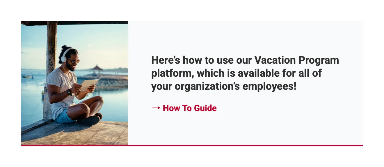
An example of a card-style CTA block for The Travel Team. The image and link point to the same destination, giving subscribers multiple places to click.
For example, if you want to direct a user to a new blog post, you can create a dedicated “card” design that visually breaks away from the area around it to add visual interest. You can link multiple parts of the card to the blog post, including a background image and a button. No matter where the user clicks on that card, they go exactly where you want them to.
Make Buttons Pop with Contrast
Leverage distinct, high-visibility accent colors that sharply contrast with your background palette. This visual separation ensures the element immediately registers as an interactive target the moment the message is opened.
Surround Buttons with White Space
Isolate your CTA by leaving ample, uncluttered margins around it. Stripping away competing elements from the immediate perimeter forces the reader’s focus directly onto the primary objective.
Position Primary CTAs at the Top
Embed your critical action point high in the layout hierarchy. Placing a clear path forward before the scroll allows motivated subscribers to take action instantly without wading through lines of supporting copy.
Be Direct and Action-Oriented
Replace passive phrases with explicit, high-energy verbs that spell out the exact reward of the click. Clear expectations reduce friction and give users an immediate reason to tap through.
Optimize Layouts for All Devices
Subscribers may open your emails on phones, desktops and tablets. If your layout fails to adapt to these varying dimensions, your design will look broken, text will shrink to an unreadable size and links will become impossible to click. Implementing responsive design means engineering your email to automatically reformat so the user experience remains seamless, no matter how or where it’s opened.
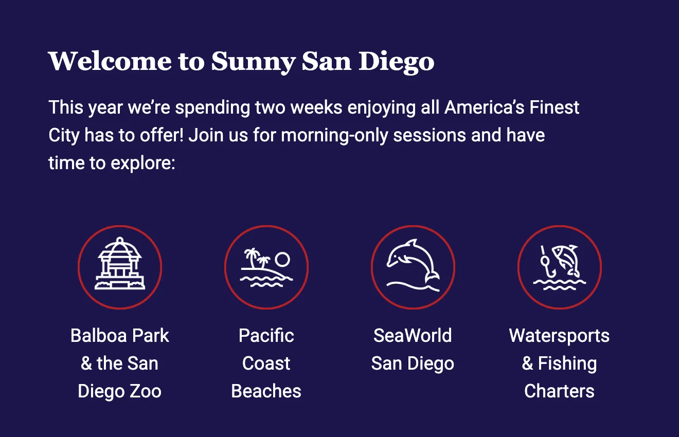
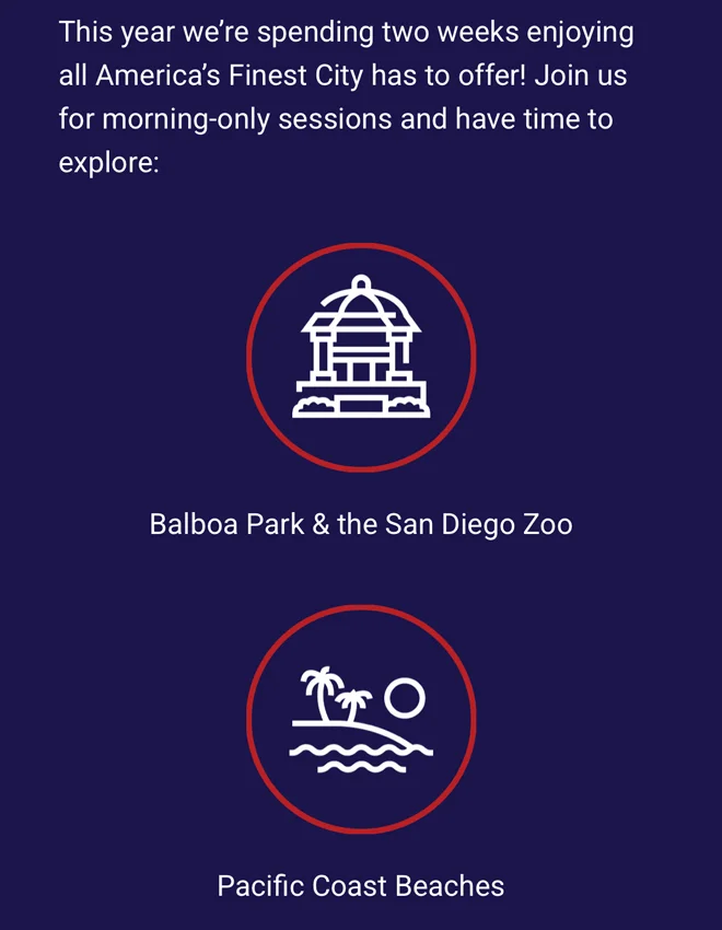
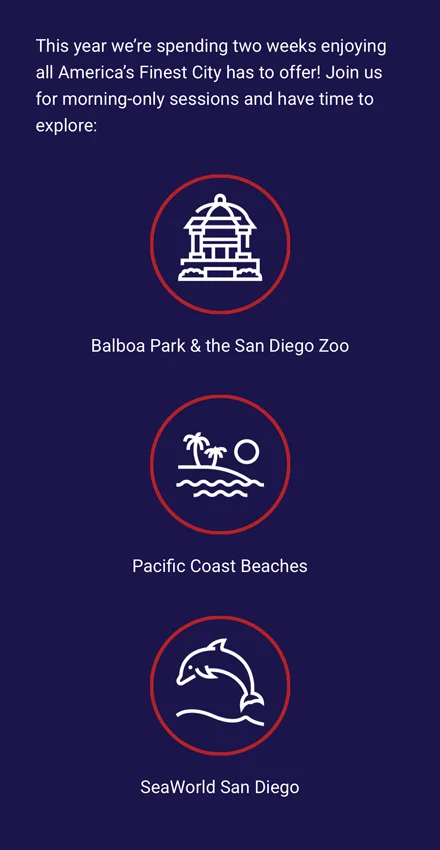
An example of the same American Medical Seminars email displayed on desktop (left) and mobile (right), where a four-column icon grid automatically stacks into a single column to stay readable on smaller screens.
For example, a side-by-side, two-column layout that looks clean on a desktop monitor must automatically stack into a single, vertical column on smaller screens. This ensures your text and images scale dynamically to match the viewer’s available screen real estate without requiring them to pinch, zoom or scroll horizontally.
Default to Single-Column Frameworks
Stacking content in a linear, vertical line ensures the reading path remains predictable. This single-path architecture gracefully collapses and expands across diverse window widths without fracturing your intended visual order.
Size Targets for Universal Use
Maintain an absolute boundary of 44×44 pixels for your interactive areas. This footprint accommodates the average human fingertip on touchscreens while remaining crisp and effortless to target with a desktop cursor.
Enforce Scalable Typography
Establish an unbreakable baseline of 14px for primary reading blocks and 22px for titles. Setting these minimums prevents subscribers from having to zoom in to parse your text.
Verify Performance Across Clients
Use preview tools to test how your layout looks across different devices and inbox apps. Catching spacing bugs or broken blocks before the final send ensures your email looks flawless, no matter where your audience opens it.
Design With Proper Dimensions and File Sizes
Your layout needs to respect the standard technical constraints of email clients, or your click-through rate will plummet. A design that breaks in the inbox or takes too long to load will be deleted before a subscriber even sees your message. Keep your formatting seamless and functional by adhering to industry standards.
Stick to a 600px Width
Capping the horizontal boundaries at 600 pixels prevents the copy from stretching awkwardly or bleeding off the edges of standard preview panes. This standard width guarantees the entire message reads naturally from top to bottom, without horizontal scrolling.
Keep the Height Concise
Restrict your vertical footprint to a target window of 1,500 pixels to 2,000 pixels. Structuring your message within these limits prevents information fatigue and keeps the reader engaged all the way through to the closing elements.
Watch the HTML File Size
Keep your underlying code lean, targeting a maximum of 75 to 100 KB. Exceeding this file weight triggers automated truncating by major providers like Gmail, which abruptly cuts off your content and buries your compliance links.
Optimize Your Images
Save asset files at widths of 600px to 800px to preserve crisp detail when scaled dynamically. Full-bleed hero visuals should match the 600px grid limit precisely, keeping their vertical dimensions between 200px and 600px to avoid dominating the screen.
Craft a Lean Content Strategy
At the end of the day, your layout only matters if you are delivering content your audience actually wants to click. You must understand what your readers care about, what interests them, and what offers them tangible value. Pay close attention to past engagement data to guide your future campaign planning.
Email is rarely the place for long-winded stories; you can’t afford to waste a reader’s limited attention span. So, your words need to count. If you try to say everything in a single message, your campaign will lose its edge. Focus on one core message and mercilessly trim the excess. Every superfluous section or unrelated block of text acts as a distracting off-ramp that pulls readers away from your primary goal.
Condense Text Blocks for Speed
Strip your copy down to a single goal with supporting content that cuts straight to the point. This creates a quick, high-impact reading experience that transitions seamlessly into your primary CTA.
Maintain a Singular Narrative Thread
Review your draft from top to bottom to ensure every element supports a solitary, unified theme. Eliminating competing ideas prevents reader confusion and keeps their attention locked on a single path.
Consolidate Secondary Links
Utilize the email footer to house icons for your digital channels. Moving social profiles and other secondary links to the bottom of your email keeps them accessible for extra brand engagement without cluttering the email body.

Tyler Schwab / Senior Designer
Tyler brings over a decade of design experience across agency, corporate in-house and freelance environments to our clients. His attention to detail, desire to design for a purpose and an ability to find inspiration everywhere sets Tyler apart from other creatives. From logos and typography to motion and web design, Tyler touches almost all of Parkway’s design projects.