A brand’s visual identity communicates its core values and personality. Together, colors, typography, imagery and other design choices become a visual identity that creates recognition and sets expectations at a glance.
As companies grow and time passes, audiences (and their preferences) change and design standards evolve; what once worked can suddenly feel stuck in another era. Outdated elements, logos that don’t scale and cluttered layouts can make even a strong brand look out of touch.
Updating your visual identity isn’t about starting over. It’s about evolving. Thoughtful design changes maintain cohesion, keep your brand consistent and recognizable. and support positive perceptions across platforms. From minor tweaks to comprehensive updates, the goal of any update is to maintain a visual identity that stays true to a brand while meeting audience expectations.
Why Brands Revisit Visual Identity
If visual identity defines a brand, why change it? The answer is because factors influencing the brand, such as audiences, markets and digital platforms, are not static. Details that originally resonated may no longer connect or function as intended.
Rather than erasing what makes a brand unique, updating elements allows the brand to continue to communicate its character and presence effectively.
“
Design is often the first impression. If it feels outdated, people assume the company itself is outdated. A refresh equals growth, relevance and professionalism.
Aryn
Inconsistency Across Materials
One of the clearest signs that a visual identity is aging is when different parts of the brand no longer feel like they belong together. As companies grow, it’s common for design elements to evolve at different speeds, leaving fonts, colors or logo variations that clash instead of complement.
What makes a brand feel strong is when everything works in visual harmony through a unified look that reinforces recognition at every touchpoint.
“It’s natural for a growing company to evolve different parts of its business at different times and at different rates, which can lead to inconsistent design. But what makes a brand strong, from a design viewpoint, is when everything works in visual harmony,” says Tyler.
Overly Complicated or Outdated Logos
Logos defined by details, gradients or intricate shapes that look great in print don’t often translate cleanly to digital platforms, where they can become unreadable at small sizes or on mobile screens.
Simplifying doesn’t mean losing character. Instead, it ensures the logo remains recognizable and functional across every platform.
Clashing Typography
Fonts have a way of timestamping design. Trendy typefaces can bring personality, but they often have a short shelf life. Once a new design trend takes over, those fonts can quickly make a brand feel tied to the past.
Typography also carries strong associations. For example, a professional serif that works for a law firm would feel out of place in a daycare.
Many older fonts also aren’t optimized for digital use, leading to readability issues on screens. Updating typography ensures a brand feels contemporary and cohesive while keeping communication clear and accessible across platforms.
Heavy or Mismatched Color Palettes
The colors you choose are more than style; colors influence how people feel. When a palette leans too dark, feels visually heavy or combines shades that don’t work well together, it can make your identity feel antiquated or disconnected.
Additionally, using inconsistent colors across platforms weakens recognition and makes a brand appear less polished.
Updating to a more harmonious palette not only modernizes your look but also builds trust, improves readability, and ensures your brand feels aligned wherever it shows up.
What Visual Updates Look Like In Practice
A refresh shouldn’t erase what makes your brand recognizable. Often, an update is about simplifying existing elements or reimaging the design so it aligns with current audiences and digital platforms.
“
Always try to evolve rather than start from scratch. Carrying important parts of the brand forward can connect the past and present.
Tyler
Refining a Logo Without Starting Over
American Medical Seminars
American Medical Seminars helps healthcare professionals meet their continuing medical education requirements through engaging conferences across the US.
Our redesign kept the company’s established color palette to maintain recognition while dropping dated gradients. A heavy primary serif font was used with a clean secondary sans serif font to convey trust and professionalism.
Aligning Digital and Physical Spaces
The Establishment
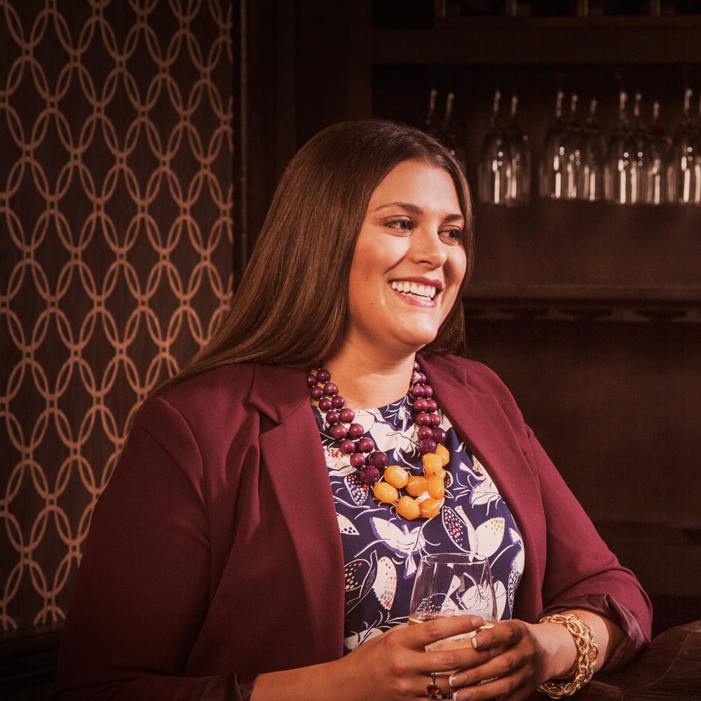
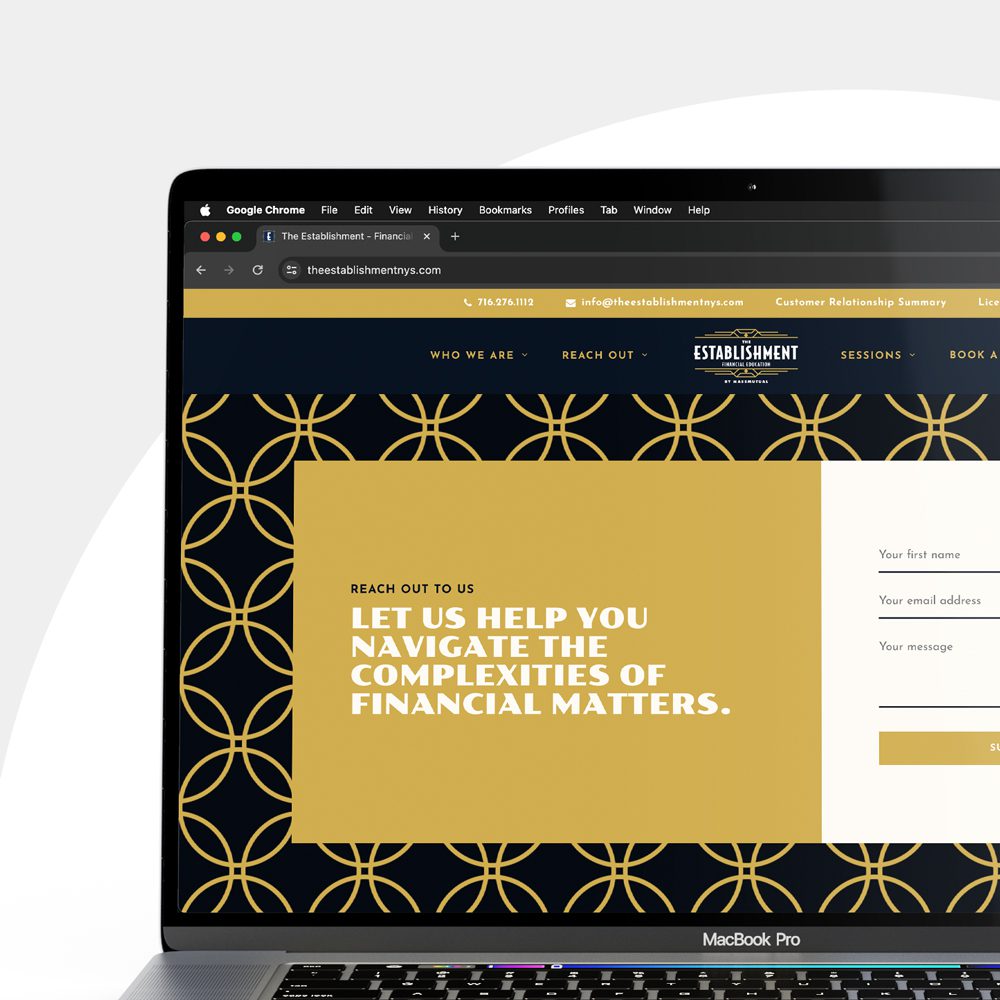
The Establishment supports Buffalonians with a range of financial education and empowerment services. For this company, consistency was key. We updated The Establishment’s website to match both their new logo and the aesthetic of their physical space. The result is a cohesive identity across digital and in-person touchpoints.

Tyler Schwab / Senior Designer
Tyler brings over a decade of design experience across agency, corporate in-house and freelance environments to our clients. His attention to detail, desire to design for a purpose and an ability to find inspiration everywhere sets Tyler apart from other creatives. From logos and typography to motion and web design, Tyler touches almost all of Parkway’s design projects.