Websites are a tool. Nothing more, nothing less. Depending on the type of business, the role of that tool can vary. But ultimately, websites are designed and built to perform a task.
Each time we discuss a new website project with a client, we start with the same question: “What are you trying to achieve?” If you are a digital agency, your website’s role might be to showcase your services, aesthetic and work. An e-commerce website would want the design to help drive online sales. A law firm website might be designed to drive inbound leads. While roles and subsequent marketing goals will vary from site to site, there is one way we measure effectiveness: conversion rate.
What is conversion rate?
Conversion rate is the percentage of users on a website who perform an action (or conversion). For example, if you have 100 users on a site over a set period of time, and 10 of them complete an action, your conversion rate is 10%. There are tons of different types of conversions. Anything you identify as a valuable action can be tracked as a conversion but the more basic (and common) are things like email signups, purchases or white paper downloads.
Tracking conversion rate is essential in judging how effective a website’s design is in achieving the goal set at the start of the project. Regardless of the specific goals you have set for your website, there are a few principles we recommend incorporating into any new website design.
Simplicity
Have you noticed the more options you have, the harder it is to make a decision? Whether it be channel surfing or ordering at a restaurant, more isn’t always better. Applying that same principle to website design is imperative in achieving your marketing goals. You want to create a roadmap, with as few opportunities for deviation as possible, for the user to complete your desired action. A simple design and navigation structure will make it easier for the user to follow the intended steps and reach the desired destination.
Calls to Action (CTAs)
There’s nothing wrong with telling a user how to interact with your site, especially if you have lead generation or sales goals. Incorporating contact forms throughout the site as opposed to driving people to a separate contact page is a small design element that improves conversion rate. Even simpler: don’t lean on consistent wording like “Learn More” on all your buttons, but tell the user what to do based on the action. Options like “Buy Now” or “Click to Call” will help guide the user to complete the desired action.
Mobile Optimization
Mobile users account for more than half of website traffic, so designing for both desktop and mobile experiences is imperative. Making sure your website experience is just as good on a phone as it is on a desktop is going to be a major factor in your overall conversion rate.
Achieving this will be different depending on the platform you build your websites on, but the concept is the same. Create a hierarchy for your messaging and stick to it on both devices. Include your most important information toward the top of the page, with clear CTAs in every section. The least important information should be further down the page. Users will spend less than a minute on each page of your website, so make sure the important details are right at the top where they can find them.
Example: Eastman Machine
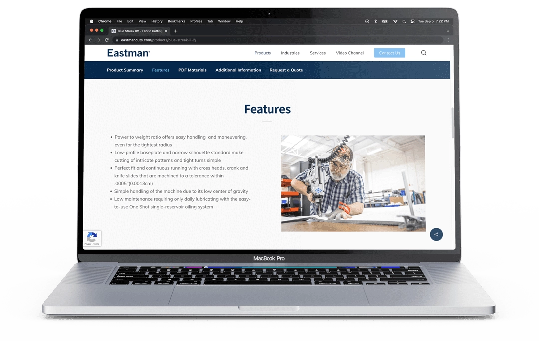
In 2021, we launched a new website for Eastman Machine Company, a cutting machine manufacturer that provides a wide range of technologies for a variety of industries. From large automated cutting solutions to hand-held manual cutting machines, the main goal for this client was to improve usability for new and existing customers, as well as increase inbound leads to the sales department.
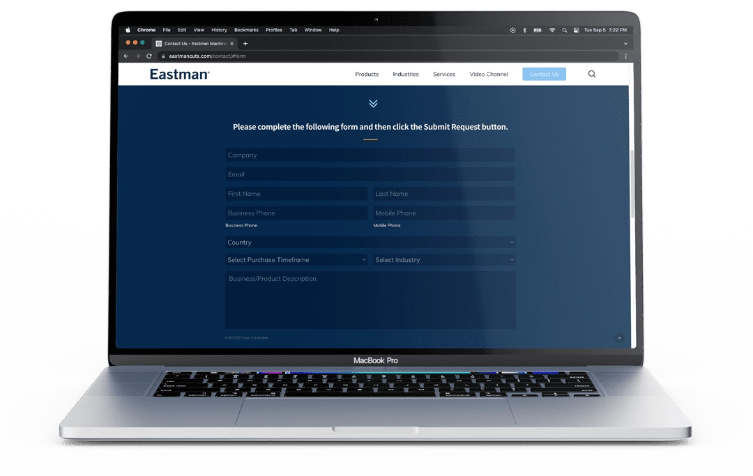
We incorporated a ton of design (and functionality) changes into the new website to improve the user experience and, ultimately, drive leads. Simplified navigation more clearly separates sales from service. An improved main menu allowed us to get users deeper into the site to look at products with fewer clicks and distractions. “Request a Quote” CTAs are included throughout each product page, and since the product pages include a lot of information, we built a sticky sub-menu to allow customers to jump right to the information they’re looking for. Our team also introduced a logic-based contact form to get inquiries to the right place faster.
In the first two months post-launch, overall conversions were up 140% and conversion rate increased by 160%. Users were more than twice as likely to reach out to Eastman regarding its products or services on the new website. Traffic stayed fairly consistent, but the users who were there were more engaged and knew exactly what Eastman wanted them to do.
It isn’t surprising that design plays such an important role in the performance of a website. The steps to improve engagement aren’t complicated and can be incorporated whether you have an agency build your business a custom website or you’re doing it yourself on Squarespace or Wix.
Simple updates can deliver major improvements in your website’s performance, and, ultimately, your profits.


