It’s no secret that strong brands are built on trust. That confidence often comes from repeated positive interactions. Moments when your audience feels like they know who you are and what to expect help create a brand experience that feels familiar and reliable. But earning that kind of trust takes more than just a great product or well-crafted messaging. It requires showing up the same way in every place your brand lives.
That’s where visual consistency comes in. This might feel like a minor detail in the bigger picture of your marketing strategy, but it plays a major role in how people perceive your brand. A few mismatched fonts or colors might not seem like a big deal, but those choices influence how credible and professional your brand appears. When your look and feel align across platforms, you become more recognizable. That familiarity builds trust, while inconsistent design across channels can leave your brand feeling disjointed and even unreliable.
What Brand Consistency Looks Like
A cohesive presence across platforms isn’t about being rigid. Instead, it’s important to be intentional and implement design standards that keep your brand recognizable, no matter where it appears. That means unifying typography, color palettes, and other design elements on every channel.
Think about your brand’s current presence across digital and traditional platforms. Ask yourself:
- Are your brand’s fonts, colors, and logo variations used similarly on websites, business listings, social media profiles, presentation decks, and printed materials?
- Does your photography style feel intentional and on-brand, or does it vary with usage and channel?
- Do icons, patterns, and graphic elements carry through across different formats and media?
The goal here isn’t to be boring or unoriginal with identical standards. What’s important is to show up repeatedly with clarity and cohesion across platforms so it’s easier for audiences to recognize and trust your brand.
We’ve seen firsthand how consistent branding can elevate a business’s presence across platforms. Take the following examples:
American Medical Seminars
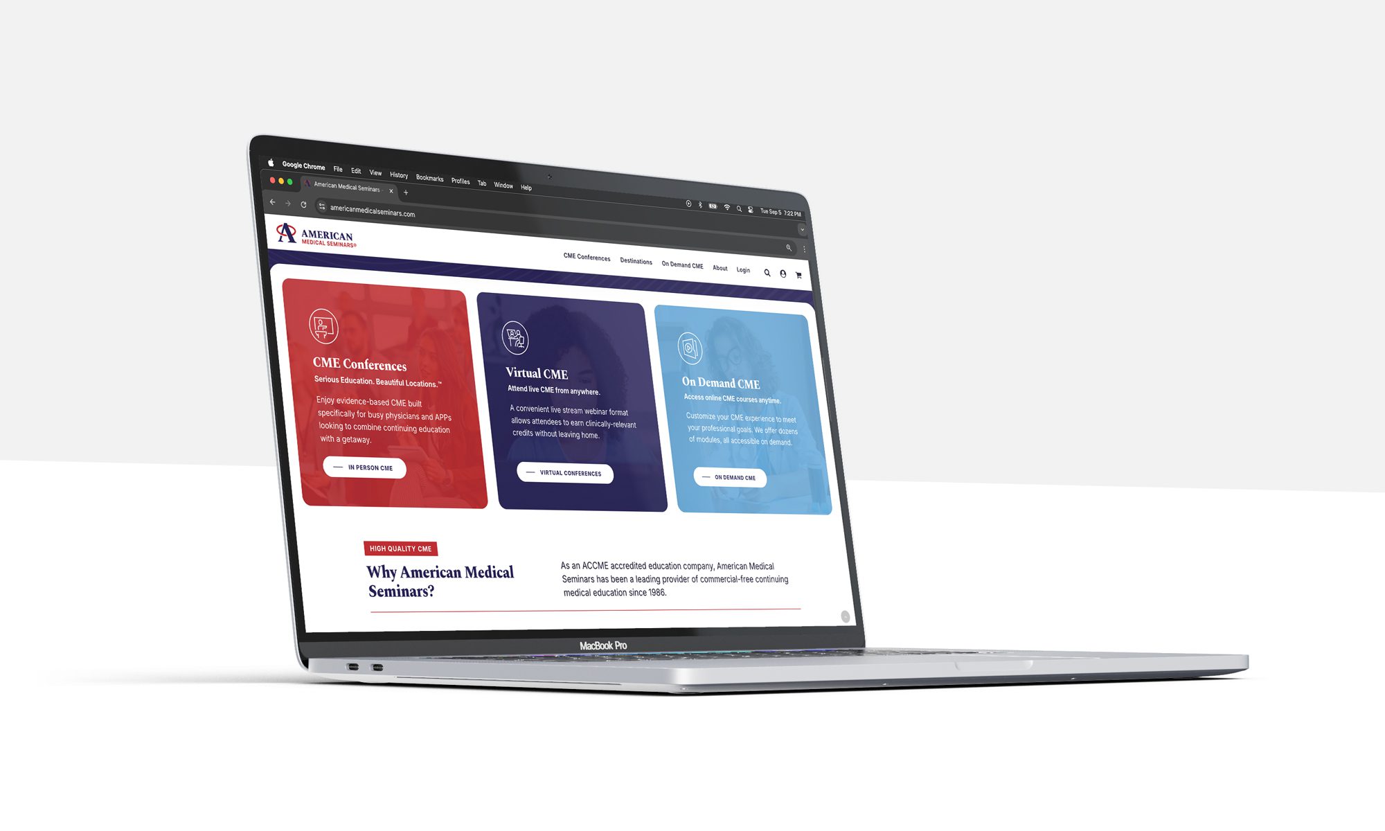
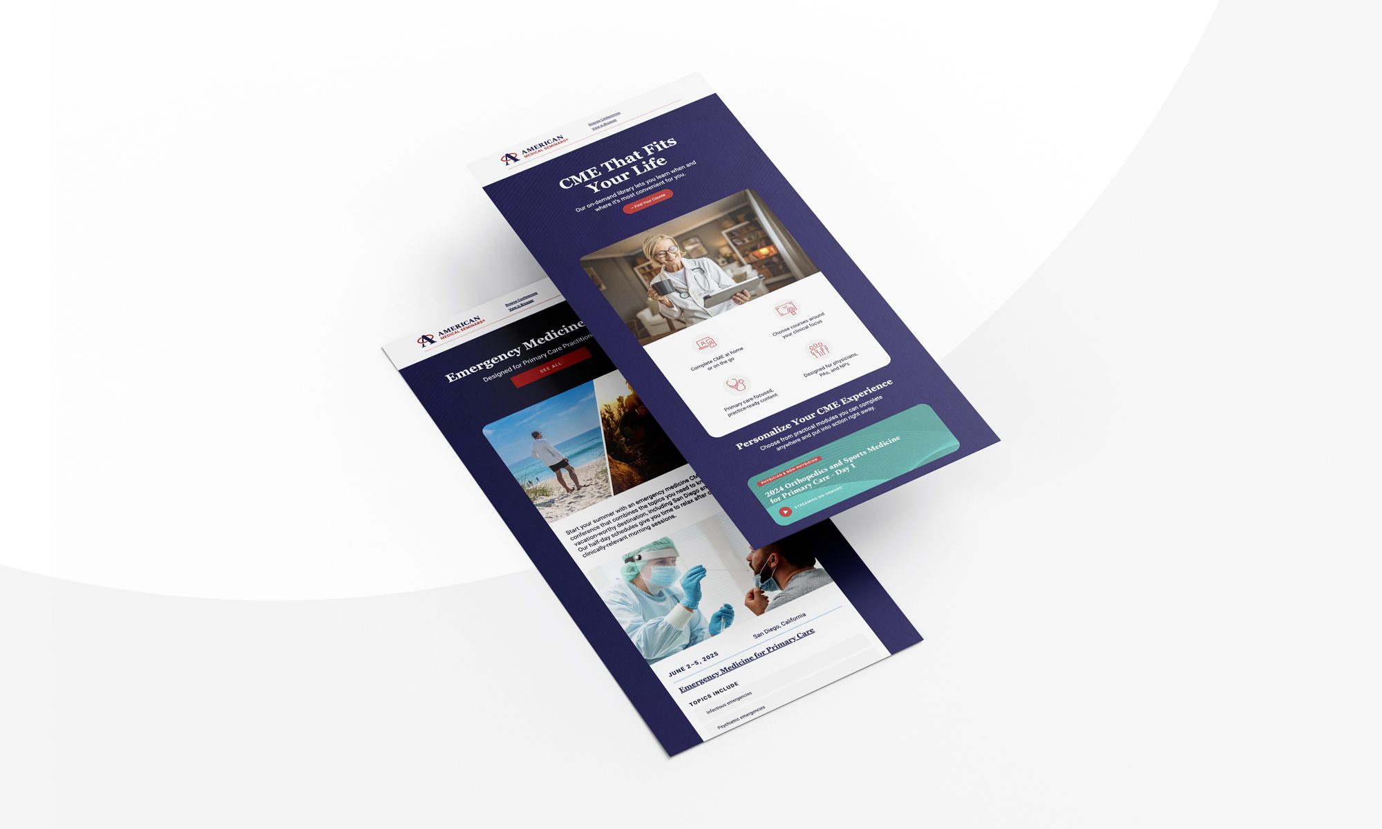
AMS is a trusted provider of continuing medical education (CME) for healthcare professionals, and its updated website and email campaigns reflect that credibility. When we refreshed the AMS website, we stayed true to their established brand identity; we used the same fonts, colors, and overall tone while modernizing the layout and user experience. That clean, professional look now carries through every touchpoint. For busy physicians, there’s no question who the message is from—AMS shows up with the same recognizable look and feel across channels.
The Travel Team
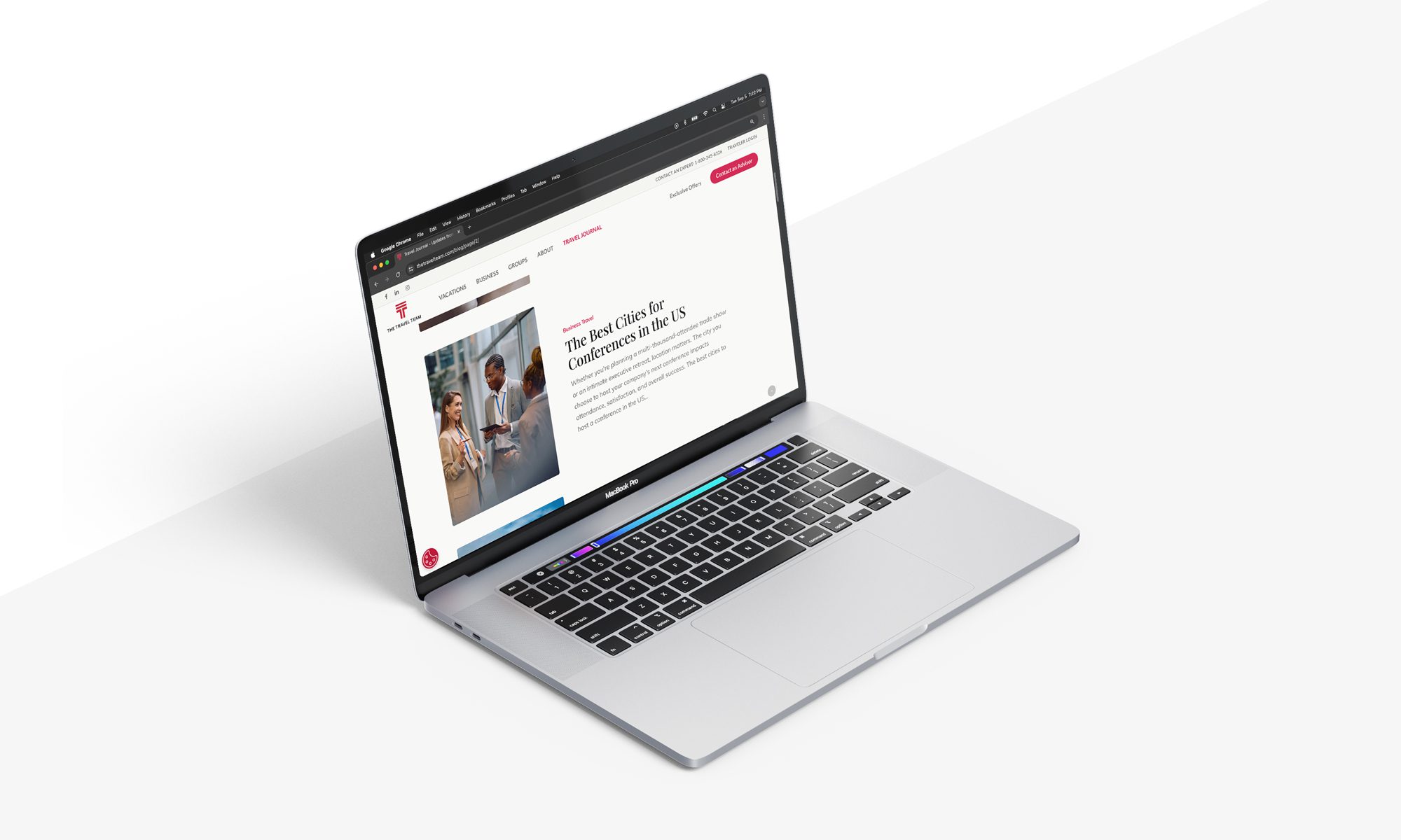
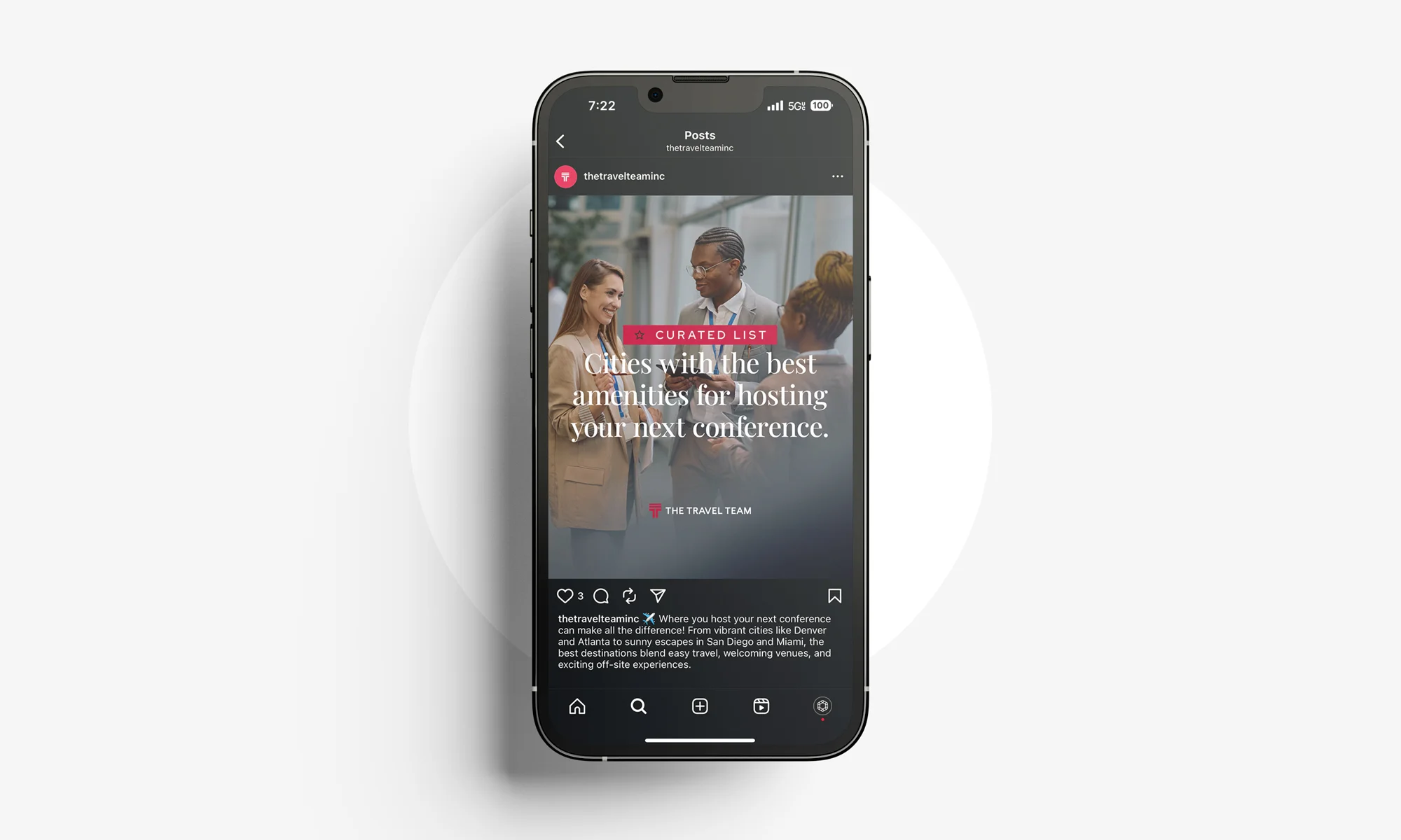
The Travel Team provides end-to-end travel services for vacationers, groups, and corporate clients so they can enjoy seamless, memorable trips. To support their professional and approachable brand, we continuously focus on ensuring branded content feels cohesive across platforms. Graphics designed for a blog post on the website are adapted for social media, tied together with the same identifiable images, fonts, and color palette. We’ve even extended The Travel Team’s look to its presentation decks and communication with current customers. This consistency strengthens recognition and helps build a sense of professionalism and polish that reflects the quality of service The Travel Team offers.