In late 2016, Google announced a shift from an index based on the desktop version of a website to a mobile-first index. This means that Google will base its understanding of your website, and therefore your business, on what it “sees” when it visits the mobile version of your website.
Google’s index is no different than any other type of index. Just as a phonebook includes a city’s residents and their contact information or a library catalog points people toward the book they need, Google’s index sorts websites. Google’s “mission is to organize the world’s information and make it universally accessible and useful.”
This year, 52% of online traffic came from mobile phones worldwide. In the US, smartphones and tablets make up 57% of online traffic. As more of the world’s population searches via mobile, Google needs to adjust how it organizes information to make it “accessible and useful.” Hence the focus on an index based on the mobile version of your website.
The new mobile-first index is not a “mobile only” index. Your website will eventually move to the new index, regardless of whether it’s desktop only, mobile only or responsive.
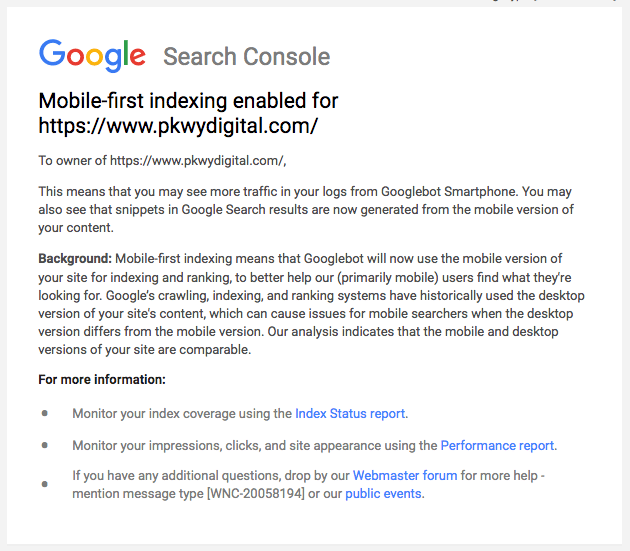
If this change was announced in 2016, why are we still talking about it? The shift from Google’s desktop-focused index to the new mobile-first index is a slow one that began in the spring of 2018. As websites are moved to Google’s mobile-first indexing, they’re notified of the change in Search Console. You may have received one of these notifications yourself in the last few months. The slow migration to the mobile first index is purposeful.
Google’s Gary Illyes noted on the Webmaster Central Blog that, “We continue to be cautious with rolling out mobile-first indexing. We believe taking this slowly will help webmasters get their sites ready for mobile users, and because of that, we currently don’t have a timeline for when it’s going to be completed.”
Preparing Your Website for Mobile Users
Notice that Google is slowly rolling out this change so that websites are ready for mobile users, not for the mobile-first index.
When you create a website for your business, your goal is not to have Google rank your website well. Your goal is to collect leads or sell products. Ranking well on Google is just one way to bring people to your website.
This same logic can be applied to the need for a mobile-friendly website. Google is shifting to a mobile-first index because of the millions of internet users who regularly search from their smartphones instead of a computer. A mobile-friendly website makes it easier for Google to understand what your company is about in the mobile-first era. However, it’s more important to realize that a mobile-friendly website design will encourage website visitors on their customer journey to continue engaging with your company.
Making Your Website Mobile-Friendly
For SEOs and web designers, Google’s new preference for the mobile version of a website comes as no surprise. Google has made many efforts over the years to reward websites that were mobile-friendly. Mobile-friendly web design has long been a factor in Google’s search engine rankings.
The mobile first index only makes it more important than ever to have a website that provides users accessible, engaging information on every screen. Now, Google bases its knowledge of your site solely on what it can “see” when it crawls the mobile version.
At Parkway, we use responsive design to create websites that look great on all screen sizes for our clients. This is the way Google prefers businesses to address the need to be mobile-friendly. Instead of making two separate websites (mobile and computer), responsive designs dynamically shift their content based on the size of the screen a viewer is using.


Responsive design, which ensures all the elements of a website are still visible to mobile users, makes the transition to the mobile first index stress-free. When Google crawls your website, all of those same elements will still be visible. Therefore, Google will be able to understand your content in the same way it did when crawling the desktop version.
This is what Google had to say on the subject: “If you have a responsive site or a dynamic serving site where the primary content and markup is equivalent across mobile and desktop, you shouldn’t have to change anything. If you have a site configuration where the primary content and markup is different across mobile and desktop, you should consider making some changes to your site.”
Is My Website Mobile-Friendly?
So how do you know if your website is mobile-friendly? Can you tell if your website will be negatively impacted by Google’s mobile-first index?
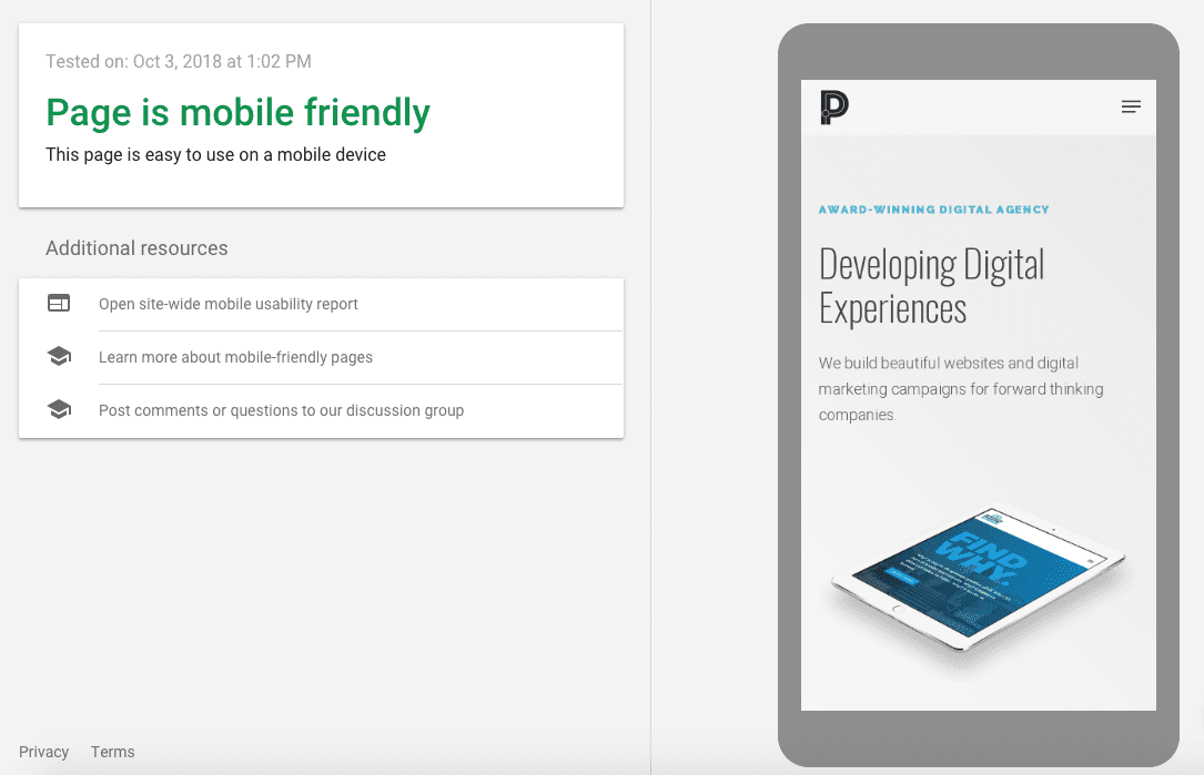
Put yourself in your customers’ shoes and visit your business’s website on your smartphone. Is it easy to read? Do you have to zoom in to use the menu? Can you easily click on buttons with your thumb? Are forms easy to fill out? Is all the same information available to this customer as a desktop user? You can also use Google’s Mobile-Friendly Test to see how Google views your website’s mobile usability.
It’s okay to move or resize images and organize content into accordions. You want to provide a great user experience for mobile users. That experience will be different than your desktop experience because the screen size and usability are drastically different. However, organizing content for better user experience doesn’t mean removing it or making it impossible to navigate to.
Mobile website UIs: Using "hamburger-menus" and "accordions" on mobile websites is fine.
— Google Search Central (@googlesearchc) June 14, 2018
As long as your customers can easily get to all of the information they need about your business from your website on their phones, you shouldn’t see any negative effects from the switch to mobile-first indexing!