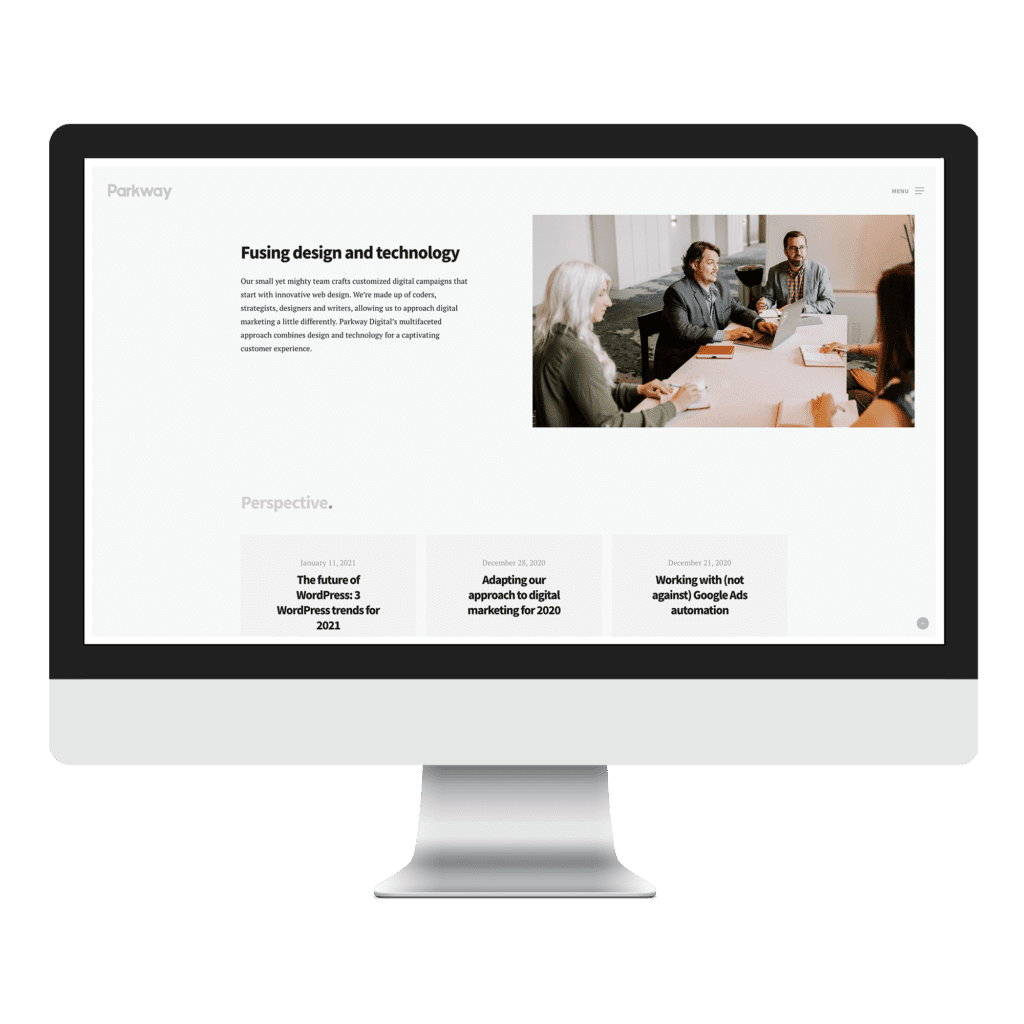
Web design is constantly changing. Looking back at last year’s predictions and seeing what other creatives are already using in 2021 gets us excited about incorporating the latest trends into our work. There are three web design trends we’re most interested in using this year. There’s also a trend we probably won’t be using but want to talk about anyway!
3 Web Design Trends We’ll Use This Year
Soothing Color Schemes
Dark mode exploded in popularity in 2020 because it offered a better user experience for those of us staring at our screens all day. Everyone relied on technology more in 2020, as everything from grocery shopping to team meetings moved online. Designing with “comfortable colors” is a 2021 web design trend that is a direct result of how much time we spent on our phones and laptops during the first year of the COVID-19 pandemic.
This year, we’re going to see a lot of earthy greens, soft blues, pale pinks, greys and tans—as opposed to solid black or harsh whites. Not only do these colors reduce eye strain, but they also offer a calming user experience. We’re excited to put this trend to use, starting with our own rebrand!
Neumorphism
Skeuomorphic design represents objects how they appear in the real world, including textures and shadows. Think about the original iPhone app icons; the notes app icon looked like a notepad. Flat design, on the other hand, is minimalist and digital-looking. This year, we’re expecting to see a lot of neumorphism, which falls between skeuomorphism and flat design. This web design trend represents real-life objects in a way that almost looks like a 3D rendering, rather than trying to replicate the item in its entirety.
Neumorphism results in a much softer, almost monochromatic look that feels embossed. There are a lot of ways to incorporate this design idea for beautiful results. The challenge with neumorphism is that its tendency toward a limited color palette leads to accessibility issues. Contrasting colors help users navigate a website, especially for visitors who are colorblind or visually impaired. With this in mind, we’ll be using aspects of neumorphic design where it makes sense for website users.
Collage
Many small businesses don’t have the budget, inventory or time for professional photography. Stock photography is a cost-effective alternative. However, you can lose an element of personalization without photos of your business, employees, products or services. Another alternative to stock photos is collage. This website trend layers photos with shapes, typography, patterns and other elements for a completely custom look.
Opting for a collage-like style adds emotion and interest to your website without relying heavily on photos. It’s also a great way to add animation to your website without investing in original video content.
The 2021 Design Trend We Don’t Love
Brutalism is back. The ‘90s are enjoying a revival, with everything from mom jeans to scrunchies to wicker furniture trending. Brutalist web design is just one more ‘90s trend you’ll see this year. This style, which is basically design that’s ugly on purpose, is related to the postwar architecture style of the same name. In fact, the name brutalist comes from the French phrase béton brut, or “raw concrete.”
Brutalist websites are pretty easy to spot, with features that starkly contrast conventional web design trends. Pascal Deville, the person responsible for the term “brutalist web design,” calls the trend a “reaction… to the lightness, optimism, and frivolity of today’s web design.” These sites look like webpages make in the late ‘90s and early 2000s, offering users “a feeling of nostalgia for the times when we only started discovering the Internet.” There are no frills here, just crowded design, single fonts, sparse imagery, one-page designs, and no clear hierarchy or navigation.
Right now, brutalism is for brands looking to interrupt the status quo. (You can find examples on Deville’s website, brutalistwebsites.com.) Websites designed in this style certainly catch your attention. Maybe that’s not a bad thing, as the internet becomes increasingly saturated. We can’t say that we’ll never incorporate elements of this trend into our work. However, you probably won’t see a Parkway Digital website fully embracing brutalist design this year.